ATV – the Danish Academy of Technical Sciences – is a national academy and independent think tank.
This client needed an updated visual identity conveying credibility and seriousness while reflecting the technical and scientific fields and presenting a strong and attractive expression.
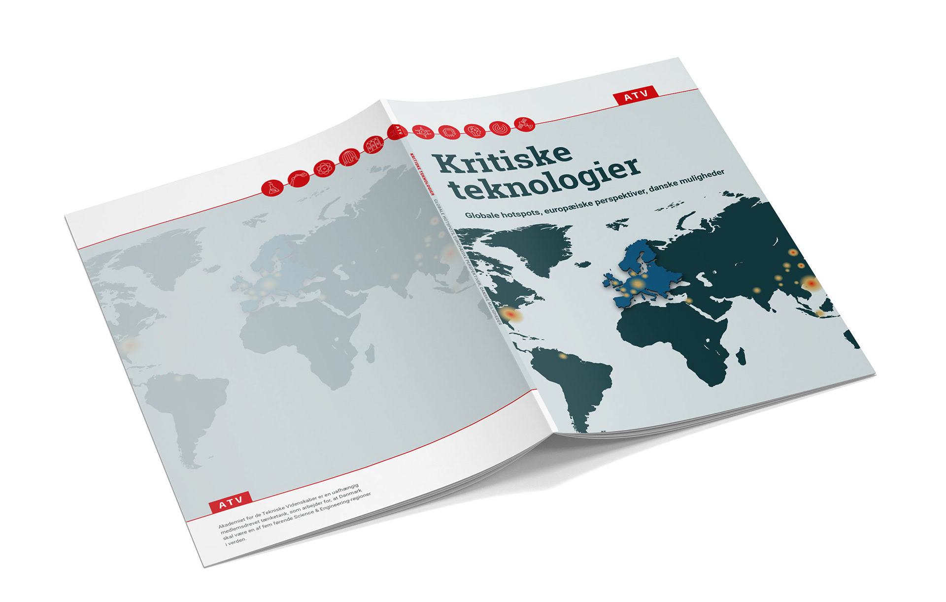
New Approach to the Logo: The logo is now positioned alongside a color and a graphic element that make the simple logo more engaging. This approach leverages its shape and color without compromising simplicity or seriousness. The design of the logo inspired this unifying graphic element, where the logo is placed on "The Red Thread," connecting it with the rest of the layout. By positioning the ATV logo in this way, a literal red thread is introduced into the identity! Since "The Red Thread" extends to the edges rather than ending abruptly, it symbolizes openness and inclusivity. Like the typography, it visually connects tradition and the future, resembling a kind of timeline.
This design approach makes ATV’s identity strong and attractive, projecting credibility and seriousness. Its simple expression allows it to encompass and unify the knowledge-heavy content from various disciplines while remaining challenging and innovative.
Design guide can be seen by clicking here
This project was created during my employment at Westring kbh.