Ressourceindsamling A/S is the municipalities' partner in waste management.
They see themselves as part of a cycle, in which they help protect our environment and resources by taking responsibility for collecting and transporting sorted waste so it can be recycled.
They see themselves as part of a cycle, in which they help protect our environment and resources by taking responsibility for collecting and transporting sorted waste so it can be recycled.
The circuit is the entire foundation of the logo. The shape of the logo mark, combined with the word Indsamling (Collection), is interconnected in one continuous motion. This begins as the dot over the "i" in Indsamling, continues around the circuit in the mark, and then flows back into the word Indsamling. The connection is further emphasized by the use of the same color.
The motion in the mark, together with the word Indsamling, can also be seen as the wheel of a car on the road, driving forward. The logo embodies a duality that conveys both resource (the circuit) and collection (the car).
The new logo appears as a cohesive whole with meaning behind it, full of dynamism and forward momentum – it is heading toward the future!
Design guide can be seen by clicking here
This project was created during my employment at Westring kbh.

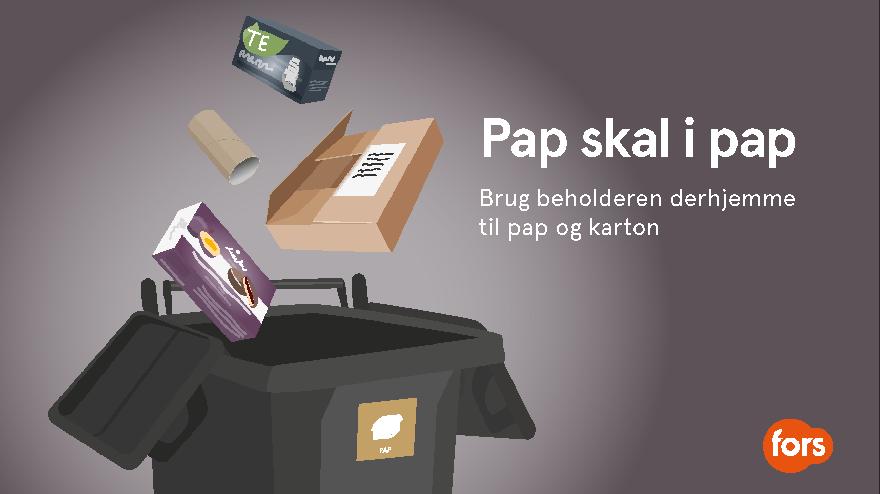
Above are several examples from the design guide: the curly graphic element, a web design concept, business cards showcasing different logo versions and the color scheme, PowerPoint templates, and a garbage truck featuring the logo and a large banner.