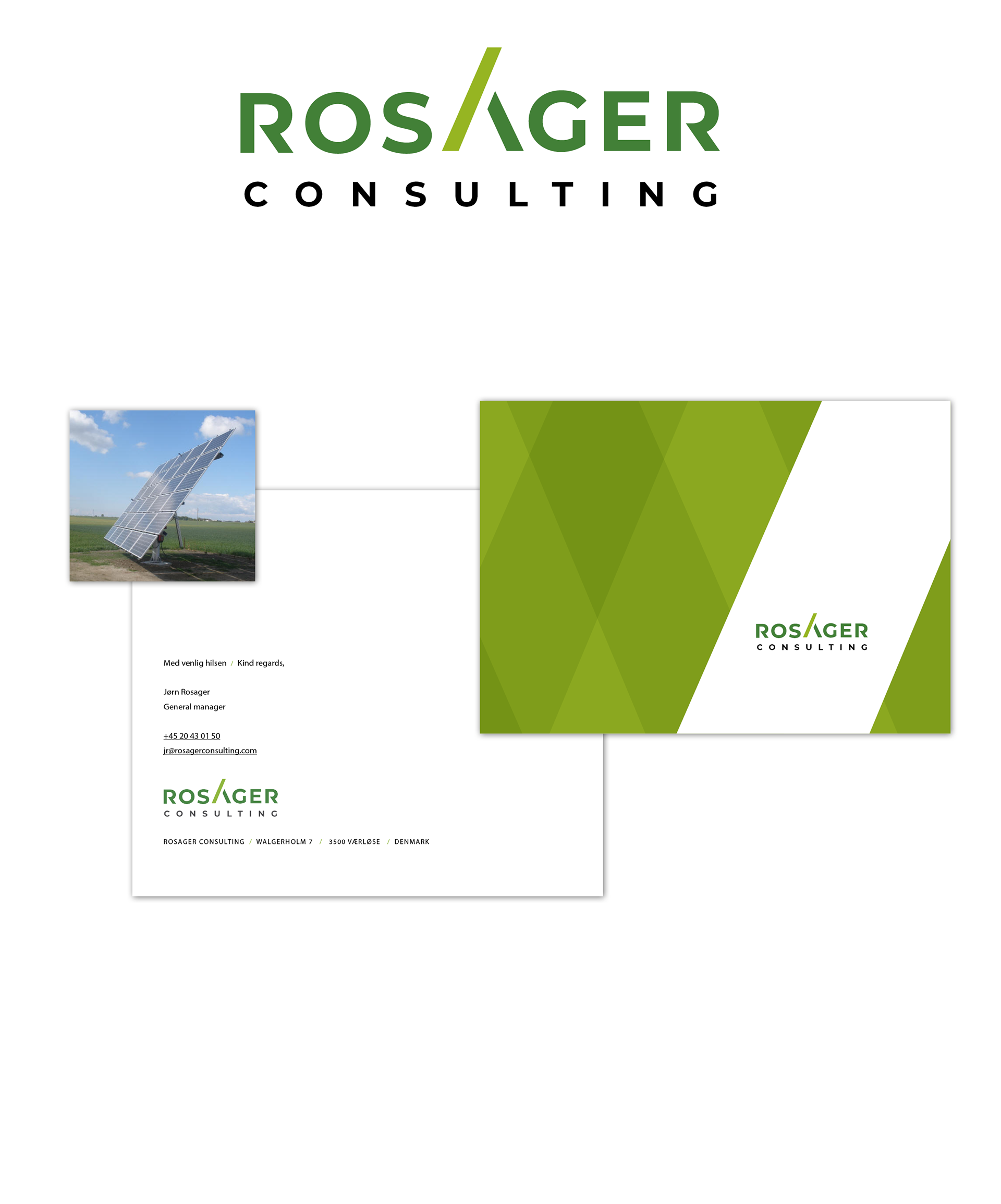
Rosager is a consulting engineering firm in the fields of Solar Energy and Greenhouses.
Meaning behind the Logo: The characteristic shape in the center, which forms the "A" in ROSAGER, is primarily a reference to the shape of a solar panel with a tracker that can tilt it. This is a central part of the company's area of expertise. The same angular shapes can also be found in greenhouses, making the logo mark a reference to both core areas.
The abstract expression and geometric shapes signal seriousness, rationality, professionalism, as well as being a reference to the engineering industry. The colors soften the expression and evoke nature and the environment, which are very important aspects of the company’s values.
The mosaic shapes in the panels also inspired a graphic element.
A presentation of the proces behind creation the logo and visual identity can be seen by clicking here
This project was created during my employment at Westring kbh.