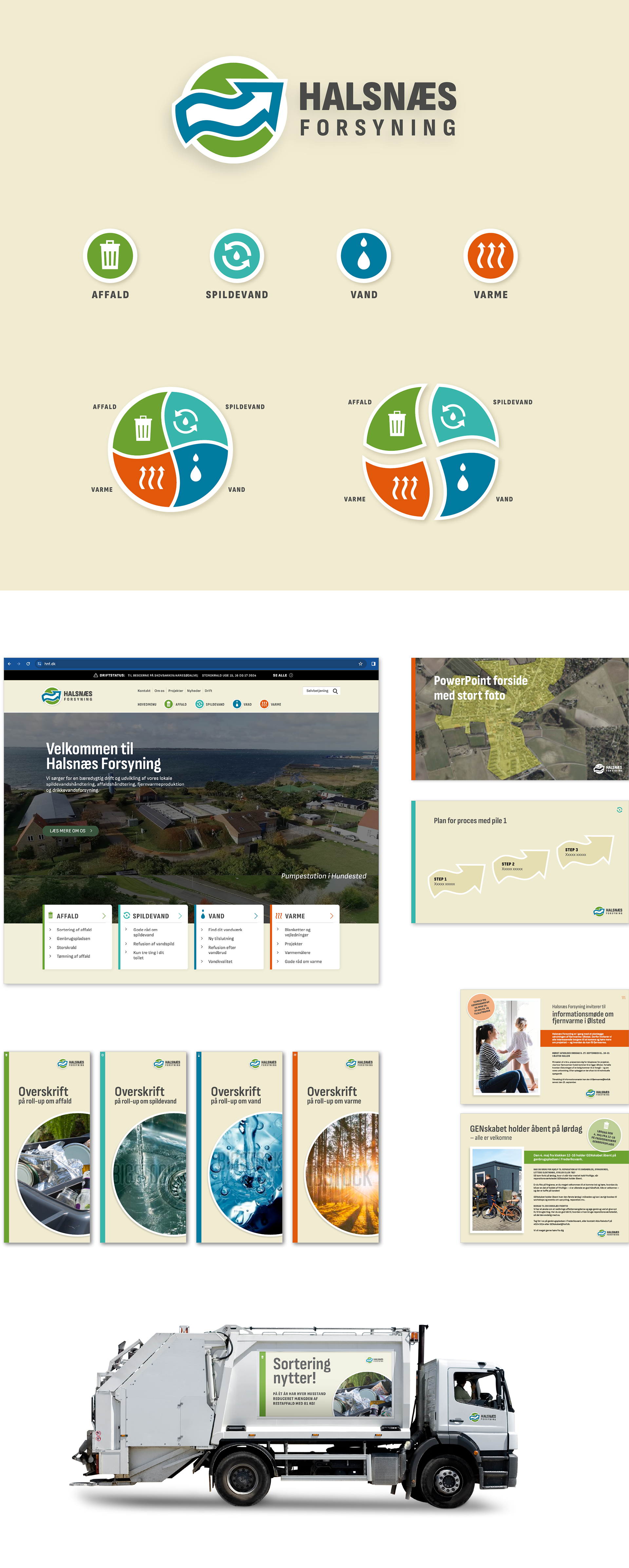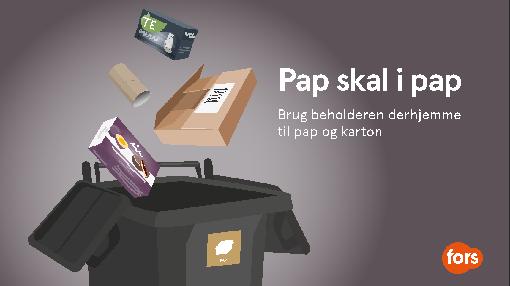
Halsnæs Forsyning needed a contemporary update of their logo and visual identity including their four utility services: Waste, Wastewater, Water, and Heating. The company has strong roots in the local community, and this is reflected in the identity through elements such as the colors of the local sandy beaches and nature, as well as local imagery. The weight and credibility of the brand are now more prominent through the use of strong typography, and Halsnæs Forsyning now has an overall cohesive and more professional expression.
Design guide can be seen by clicking here
This project was created during my employment at Westring kbh.